
Color Grading Basics: Setting the Mood of Your Film
Written by: The Buddi Team
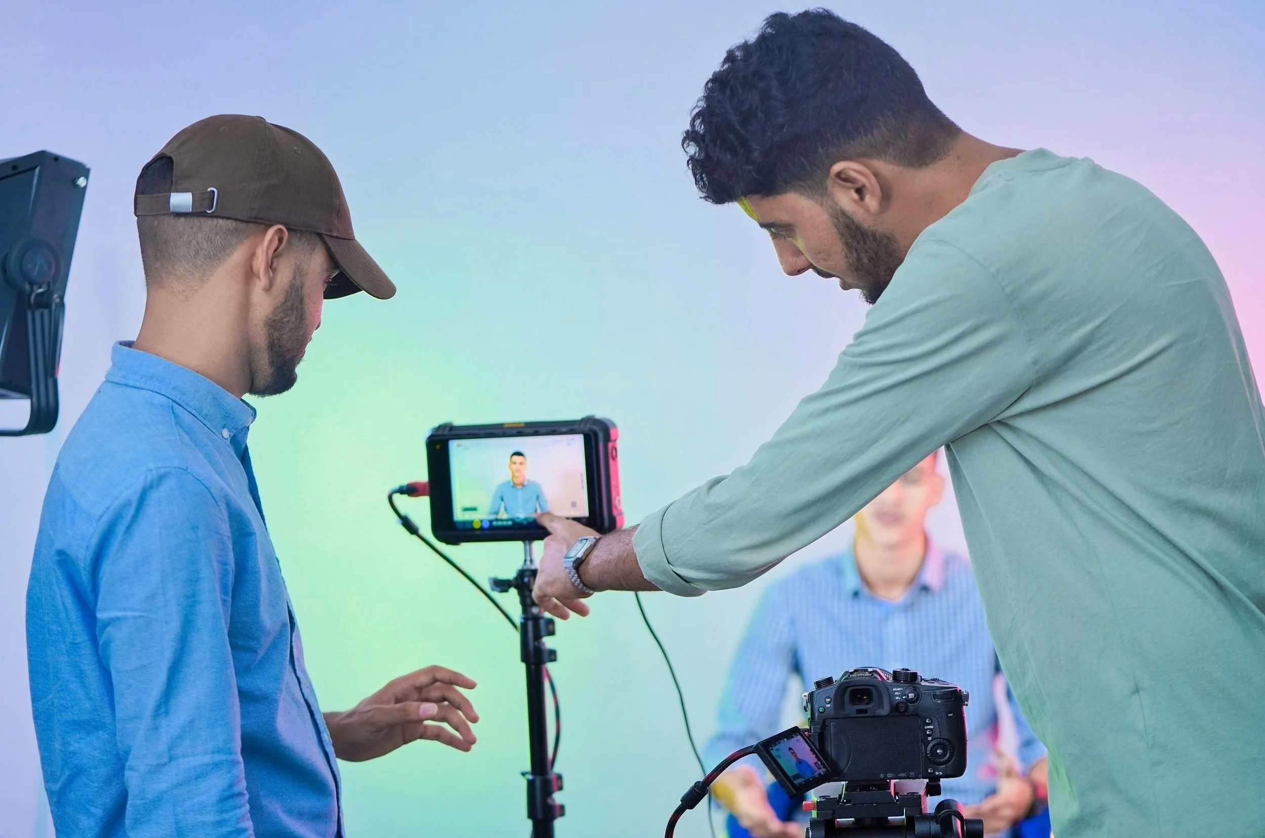
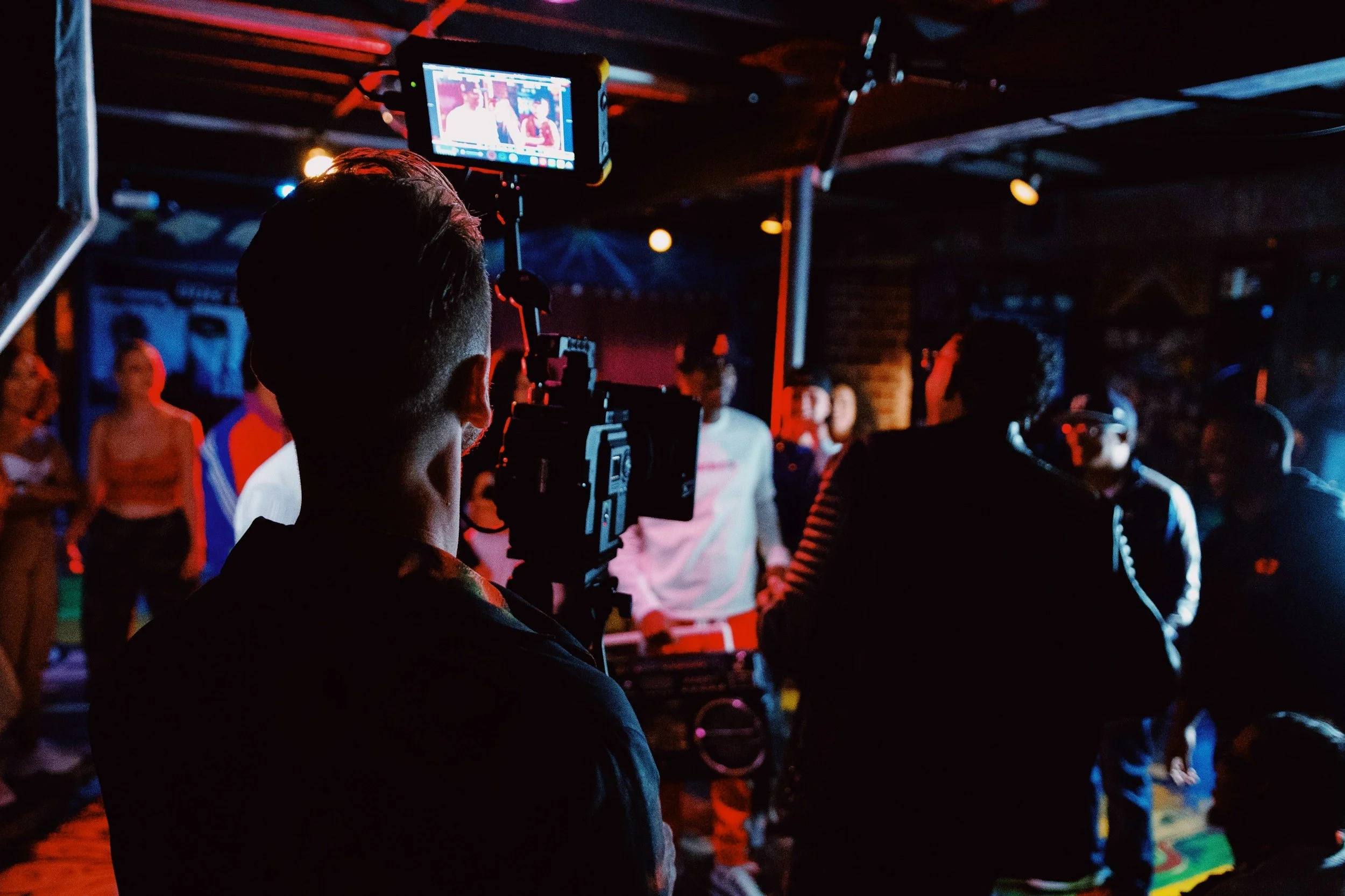
In the world of filmmaking, if the script is the soul and the cinematography is the body, then color grading is the emotion. It is one of the most powerful tools in a director’s or editor's arsenal—the final layer of storytelling that tells the audience exactly how they should feel about what they are seeing.
Whether you're aiming for the gritty realism of a crime drama or the ethereal glow of a romance, understanding the basics of color grading is essential for any creator.
1. Correction vs. Grading: Knowing the Difference
Before you can set a mood, you have to establish a baseline. It’s important to distinguish between these two distinct phases of the "color" process:
Color Correction (Technical): This is the first step. It involves fixing issues like improper exposure, incorrect white balance, and matching the "look" of different cameras used on set. The goal is to make the footage look natural and consistent across every shot.
Color Grading (Creative): This is where the magic happens. Once the footage is corrected, you apply a "look" to enhance the narrative. This is a stylistic choice used to evoke a specific atmosphere, time of day, or emotional state.
2. The Psychology of Color
Colors trigger subconscious emotional responses. When grading, you aren't just making a shot "pretty"; you are manipulating the audience's psychology.
3. Essential Concepts for the Edit Suite
If you're just starting out, keep these three pillars in mind to ensure your grade doesn't fall apart:
Contrast and Pivot: Contrast is the difference between your darkest shadows and brightest highlights. Increasing it adds "pop" and drama; decreasing it creates a flatter, "log" or vintage look. Use the pivot tool to decide where that contrast center point sits.
The "Teal and Orange" Look: You’ve seen it in every blockbuster. Why? Because skin tones live in the orange spectrum, and teal is its complementary color. This contrast makes characters stand out from their backgrounds, creating a pleasing, cinematic depth.
Trust Your Scopes, Not Your Eyes: Your eyes adjust to color over time (chromatic adaptation). Always use Waveforms and Vectorscopes to ensure your blacks aren't "crushed" (losing detail) and your skin tones are landing on the correct "skin tone line."
4. Tips for a Professional Finish
Grade for the Story, Not the Trend: Don't just slap on a popular LUT (Look-Up Table) because it’s trendy. Ask yourself: "Does this grade support the character’s journey?"
Maintain Skin Tone Integrity: You can push the environment into extreme colors, but if the actors' skin looks green or purple, the audience will lose their connection to the performance.
Consistency is Key: A beautiful grade on one shot is useless if the next shot in the scene looks completely different. Ensure your grade flows seamlessly from cut to cut.
Final Takeaway
Color grading is the bridge between a "video" and a "film." It provides the subconscious cues that immerse your audience in your world. Start with a clean correction, choose a palette that reflects your narrative, and always let the emotion of the scene guide your hand.
Check out Buddisystems
Sign up for Buddisystems today and unlock a world of creative possibilities!